
Jetpack compose is out for developer preview as was announced in Android Dev Summit 2019. It has been creating a buzz around the town with it’s declarative UI capabilities.
I recently got around to trying Jetpack Compose and I actually started liking it! Let me preface this by saying that I actually didn’t like Flutter that much. Even though it’s got all the power of state management, declarative UI, but with DART, it still feels primitive.
In this introductory article on Jetpack Compose, we’ll take a look at what is Compose and also build a simple application to get a hang of it.
What is Jetpack Compose?
Jetpack Compose is a library in Android Jetpack which enables developers to build composable functions. Think of composable functions as regular Kotlin functions that return a View.
This function when called, adds a view to your layout. They are annotated with @Composable annotation. Let’s have a look at an example function below
@Composable
fun Greeting(name: String) {
    Text(
            text = "Hello $name!",
            modifier = Spacing(24.dp)
    )
}
We can also have multiple nested views such as below:
@Composable
fun Content(counterState: State = State()) {
    Column(modifier = ExpandedHeight, crossAxisAlignment = CrossAxisAlignment.Center) {
        Column(modifier = Flexible(1f), crossAxisAlignment = CrossAxisAlignment.Center, mainAxisAlignment = MainAxisAlignment.Center) {

        }

        Row(modifier = ExpandedWidth, mainAxisAlignment = MainAxisAlignment.End) {

        }

    }
}
If you’ve worked with Flutter, this might seem very similar to you. And it is! Jetpack Compose feels like Flutter on Native steroids….
Some of the best features of Jetpack Compose are:
- Building declarative UIs.
- Added support in Android Studio 4 for previewing layouts instantly.
- Views can be broken down into functions and can be used at multiple places.
- State management with @Model data classes is really powerful. We’ll look into this more in the coming sections.
But it’s not all sunshine and rainbows. I’ve some concerns with compose too such as:
- UI and Logic being coupled together. I feel since Jetpack Compose will move UI to kotlin files, this may lead to code coupling.
- Nesting: I had this problem with flutter and it’s not getting better even in Compose. Maybe it’s just me, but the idea of multiple nested curly braces is just daunting to me.
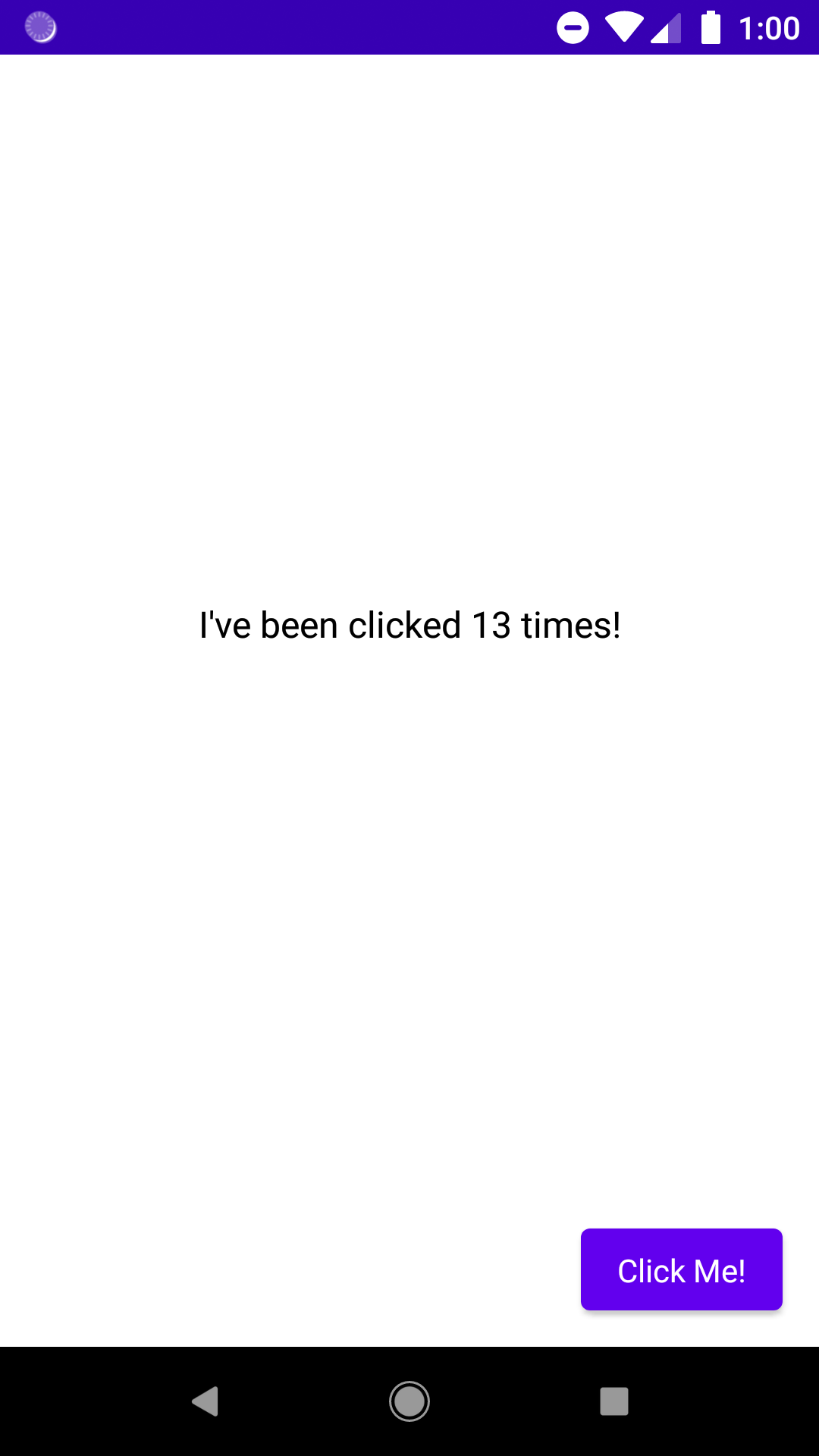
Nonetheless, it’s here and it’s recommended by Google. So, let’s see what it feels like to develop a simple hello world kinda application using Jetpack Compose in android. Here’s what it would look like:
Android Studio 4.0 Preview
You’ll not be able to use Compose on your current version of Android Studio. For this, you’ll need to install AS 4.0 from the canary channel.
class MainActivity : AppCompatActivity() {
    override fun onCreate(savedInstanceState: Bundle?) {
        super.onCreate(savedInstanceState)
        setContent {
            MyApp {
                Content()
            }
        }
    }
}
To change to canary channel follow these steps:
- Go to Settings(Win)/ Preferences(Mac).
- Then go to System Settings -> Updates
- From there you can change your stable channel to canary channel.
Then check for updates. It’ll ask you to download AS 4.0 Preview. So, download and install it. Now we’ll be creating a new project for compose.
Go to File -> New -> New Project and select Empty Compose Activity. From there on follow the wizard normally and select finish.
Lambdas, Lambdas Everywhere!
First thing you’ll notice is that the setContent function is now accepting a lambda. This is how Jetpack Compose works. Functions accept composable functions as lambdas and their properties as parameters.
If you dive deeper into the code by pressing Cmd+Click you’ll notice that setContent now accepts a composable function as parameter. Composable params are also annotated with @Composable.
Back to our code, we’re passing in the MaterialTheme which is denoting that our app will be built using Material Design. Then finally we pass the Greeting composable which is essentially a TextView.
Moving further, you’ll notice a method annotated with @Preview.
@Preview("MyScreen preview")
@Composable
fun MyPreview() {
    MyApp {
        Content()
    }
}
This indicates that the method must be used to preview the layout. You can see the preview on the right hand side window pane.
Creating our Layout
Theming our app
First let’s move out the responsibility of setting the theme of our app to a separate function.
@Composable
fun MyApp(children: @Composable() () -> Unit) {
    MaterialTheme {
        Surface(color = Color.White) {
            children()
        }
    }
}
Note: This function is outside our MainActivity.kt class
MyApp() is a composable function that accepts another composable function. We’ll also set the background for the app using Surface which is another element from Compose UI toolkit. Finally, we pass in the lambda we receive. This’ll ensure we have all the children encapsulated inside this theme.
Adding Text and Button
Next up, let’s begin by adding some content to our screen. Create another function named Content() which is a composable function.
To place the text at the center of the screen, create a Column which fills the entire height of the screen. This will be the root container.
@Composable
fun Content() {
    Column(modifier = ExpandedHeight, crossAxisAlignment = CrossAxisAlignment.Center) {

    }
}
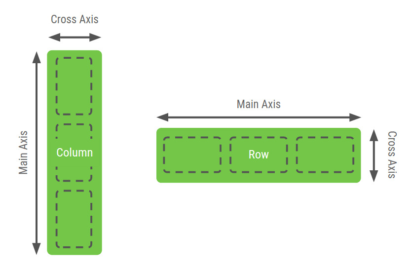
Think of Columns and Rows as just LinearLayout with orientation as Vertical or Horizontal respectively. They stack their children one by one.
Rows and Columns have two axes, MainAxis and CrossAxis. This is better explained in the image below:
Next, we need to create a container to add the text. This container contains just the text. Expand this container to fill the entire height of the screen. We do this by passing in the ExpandedHeight modifier.
@Composable
fun Content() {
    Column(modifier = ExpandedHeight, crossAxisAlignment = CrossAxisAlignment.Center) {
        Column(modifier = Flexible(1f), crossAxisAlignment = CrossAxisAlignment.Center, mainAxisAlignment = MainAxisAlignment.Center) {
            Text(text = "I've been clicked 0 times!")
        }

    }
}
For the second column, we have added Flexible() as modifier. This tells the column to cover the screen with weight 1. This can be thought of as a vertical LinearLayout with weight 1.
Similarly, in our root Column, we’ll add a Row with MainAxis aligned to the end. This will help us align our button to the end. Finally, we add the button. Button is returned from the Counter function.
@Composable
fun Content(counterState: State = State()) {
    Column(modifier = ExpandedHeight, crossAxisAlignment = CrossAxisAlignment.Center) {
        Column(modifier = Flexible(1f), crossAxisAlignment = CrossAxisAlignment.Center, mainAxisAlignment = MainAxisAlignment.Center) {
            Text(text = "I've been clicked ${counterState.count} times!")
        }

        Row(modifier = ExpandedWidth, mainAxisAlignment = MainAxisAlignment.End) {
            Padding(padding = 16.dp) {
                Counter(counterState)
            }
        }

    }
}
Adding User Interaction and State Management
Now it’s time to make something happen when user clicks the button. Essentially, we want to increase our counter whenever the button is clicked.
For this, we’ll store the current state of counter in a data class containing a count variable.
@Model
class State(var count: Int = 0)
Notice the @Model annotation. This indicates that this data class is to be observed for changes. Composable functions which read the data from @Model annotated classes, will recompose whenever data changes. Thus updating the UI.
Now, we’ll pass the instance of this State object in the Content function. We’ll alter our message to include the count in between as such.
@Composable
fun Content(counterState: State = State()) {
    Column(modifier = ExpandedHeight, crossAxisAlignment = CrossAxisAlignment.Center) {
        Column(modifier = Flexible(1f), crossAxisAlignment = CrossAxisAlignment.Center, mainAxisAlignment = MainAxisAlignment.Center) {
            Text(text = "I've been clicked ${counterState.count} times!")
        }

        Row(modifier = ExpandedWidth, mainAxisAlignment = MainAxisAlignment.End) {
            Padding(padding = 16.dp) {
                Counter(counterState)
            }
        }

    }
}
Note: We’ve used default parameter as instance of State class, so our Content method can be called with no parameters.
Next up, let’s add functionality to our button to increment the counter. Pass the state object in Counter function. Our button accepts a lambda for onClick. We’ll pass a lambda to increment our counter. This will cause Text to recompose and update the UI.
@Composable
fun Counter(state: State) {
    Button(text = "Click Me!", style = ContainedButtonStyle(), onClick = {state.count++})
}
I specifically chose this Counter App, but why?
I intentionally chose to create this counter app. Reason being that this is similar to the app you get pre-built when creating a new flutter project!
I wanted to contrast the differences in building a similar app in Flutter vs Jetpack Compose. And building UI in Compose has been a pleasure. Much more than in Flutter. But this may be a bias I have as I develop native apps in Kotlin mostly.
What’s your experience with Jetpack Compose? Mention in the comments below! Let’s have a chat 🙂
*Important*: Join the AndroidVille SLACK workspace for mobile developers where people share their learnings about everything latest in Tech, especially in Android Development, RxJava, Kotlin, Flutter, and mobile development in general.
Click on this link to join the workspace. It’s absolutely free!
Like what you read? Don’t forget to share this post on Facebook, Whatsapp, and LinkedIn.
You can follow me on LinkedIn, Quora, Twitter, and Instagram where I answer questions related to Mobile Development, especially Android and Flutter.
If you want to stay updated with all the latest articles, subscribe to the weekly newsletter by entering your email address in the form on the top right section of this page.